When you design a website one of the main tasks is to choose the right color scheme. Your success directly depends on it. Users always concentrate on colors which attract them or not visiting a specific website. It’s important not forget that color schemes are a fundamental part of not just designing website, but how every one of us perceives the world. Web designers understand this well and they use color schemes as one of the tools creating a website. If you haven’t got proper skills in web design, it could be difficult to choose the right color for your project. You’ll spend much time looking for a perfect combination.
Designers in DarinX have enough experience in matching colors and are ready to provide you a list of the best color combinations. Look at these stunning examples of the best web design color schemes and choose a stunning palette for your project. To make this task even easier you can see hex codes to find the necessary color. We are assured that with our help all of your designs will look eye-catching and easily attract customers’ attention.
1. WARM COLORS
This color combination looks really balanced and cool. Cool hues are perfectly united with warm shades in this palette. If you create a youthful or modern project, such scheme is a perfect choice for you.
2. BRIGHT PALLETTE
It’s hard to see another eye-catching combination. This scheme includes blue and violet hues together with some bright accents presented in thrilling red. Pay your attention how blue background perfectly suits when you want to draw customer’s attention to specific places, which are designed in red.

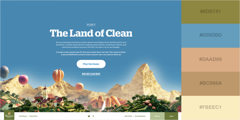
3. EARTHY DESIGN
Blue sky always brings a feeling of comfort. This color scheme isn’t an exception. It highlights a picturesque outdoor scene. Such color combination will be a fantastic option for designing projects connected with nature and environment
4. COOL EMERALD GREEN
This color scheme looks fresh thanks to the green palette. And dark blue tones help to emphasize important details. At the same time this combo, reminding ocean-related setting, creates a feeling of refreshment and originality.

5. SOPHISTICATED COLOR SCHEME
Combination of these hues is perfect and stylish. It will be ideal for elegant designs. It looks smooth and cosmopolitan. Such design, combining blue and grey tones, will be great for conservative projects.

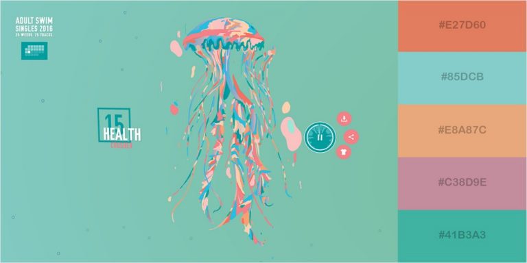
6. LIVELY COLOR COMBO
This combination of shades united all lively colors, which remind us life, nature, and creativity. Candy pink attracts viewer’s attention and could be used for the most important buttons or other details, while lavender gray will be ideal for a background.

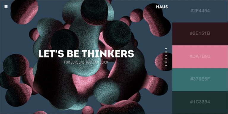
7. MODERN TEXTURIZED COLOR COMBINATION
The color of charcoal and dark violet shades made this modern-looking combination perfect for futuristic projects. Eye-catching tones will look great in the design of magazines and other editorial content.